Barbie-Inspired Hot Pink Chosen as Pantone’s Color of the Year: Exploring Its Cultural Impact and Trend Influence
Hot Pink’s rise from a playful doll accessory to Pantone’s Color of the Year underscores its power to shape fashion, design, and pop culture. By celebrating this vibrant hue, Pantone highlights the Barbiecore aesthetic, evokes the psychology of pink, and offers a blueprint for brands and interior designers to harness bold self-expression. In this article, we’ll unpack how Barbie and her cinematic revival fueled the Barbiecore movement, trace hot pink’s emotional resonance and evolving symbolism, reveal Pantone’s rigorous selection process and industry ripple effects, and deliver actionable styling, décor, and branding strategies—culminating in a forward-looking view of pink’s next chapter.
What Is the Barbiecore Aesthetic and How Does It Influence the Hot Pink Trend?
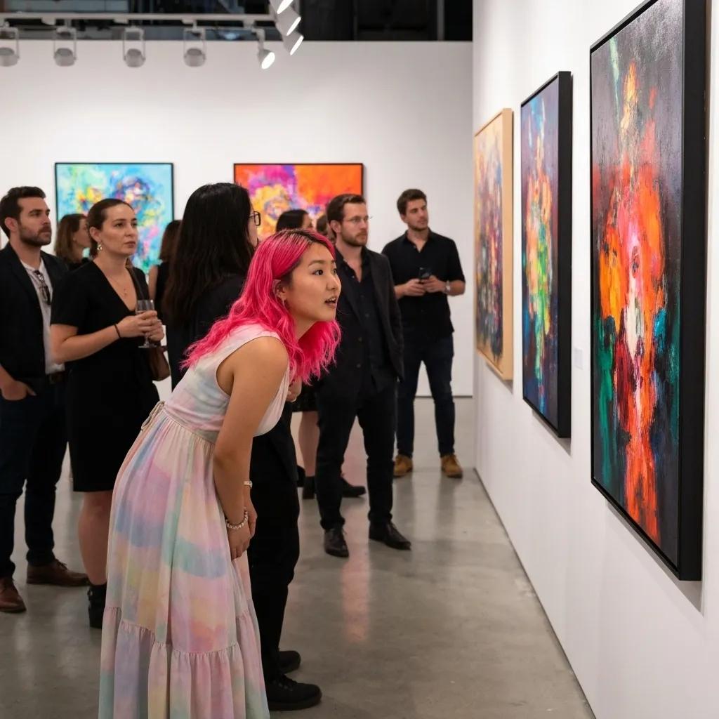
Barbiecore describes a hyper-feminine aesthetic anchored in glossy pinks, playful silhouettes, and nostalgic references to Mattel’s iconic doll. This trend leverages the fantasy world of Barbie to drive hot pink’s dominance in wardrobes, social feeds, and retail collections, boosting consumer confidence through joyful color immersion and familiar storytelling.
How Did Barbie Inspire the Rise of the Barbiecore Aesthetic?
Barbie’s cultural imprint spans six decades, and her ongoing reinventions have shaped style narratives:
- Iconic Wardrobe Evolution – From her debut ball gown to modern streetwear collaborations, Barbie’s outfits have always emphasized bold color cues that resonate with each generation.
- Nostalgia-Driven Marketing – Mattel’s anniversary campaigns and limited-edition dolls reignited interest among collectors and influencers, bridging childhood memories with adult self-expression.
- Collaborations with Fashion Houses – Partnerships with designers like Moschino and Balmain injected couture credibility, turning pink into a symbol of high-fashion audacity.
By linking these elements, Barbie set the stage for Barbiecore’s global takeover, naturally leading us to examine how her blockbuster movie amplified this surge.
What Role Did the Barbie Movie Play in Popularizing Hot Pink?
The 2023 Barbie film directed by Greta Gerwig propelled hot pink into the mainstream through:
- On-screen saturation of the dollhouse set in Pantone 219 C, creating an immersive visual feast.
- Costume design that balanced retro silhouettes with vibrant color blocking, inspiring runway and street-style echoes.
- Strategic social media moments—#Barbiecore challenges and fan art—that reinforced pink’s association with empowerment and whimsy.
[Fashion Trends and the Role of Social Media]
This citation relates to the article’s discussion of how the Barbie movie and social media contributed to the popularity of the Barbiecore aesthetic and the hot pink trend.
This cinematic moment crystallized Barbiecore’s momentum, making hot pink a cultural rallying point and inviting us to explore its real-world reflections.
How Is Barbiecore Reflected in Fashion, Design, and Lifestyle?
Barbiecore’s signature pink pops across multiple domains:
- Fashion: Crop tops, vinyl miniskirts, and monochrome ensembles showcase vivid pink as a statement.
- Graphic Design: Marketing collateral and product packaging adopt neon pink accents to convey energy and optimism.
- Lifestyle: Beauty brands release limited-edition pink palettes, while cafés offer pink-themed menus and décor for Instagram-worthy moments.
By infiltrating wardrobes, digital art, and everyday experiences, Barbiecore transformed hot pink from a niche fad into a pervasive expression of confidence and creativity.
What Is the Psychology and History Behind Hot Pink?
Hot pink’s appeal extends beyond surface vibrancy: it taps into deep-seated emotions and centuries of color symbolism. Understanding these layers illuminates why Pantone recognized its cultural relevance.
What Emotions and Meanings Are Associated with Hot Pink?
- Playfulness: The hue stimulates joy and spontaneity.
- Confidence: Its boldness encourages self-assertion and visibility.
- Youthful Energy: High-intensity pink conveys vitality and optimism.
- Empowerment: By subverting traditional gender norms, hot pink empowers individual choice.
These associations underpin hot pink’s magnetic pull in fashion and marketing, setting the tone for its historical journey.
[The Psychology of Color and Its Influence on Consumer Behavior]
This research supports the article’s discussion of the psychology behind hot pink and its impact on consumer behavior within the context of the Barbiecore aesthetic.
How Has the Symbolism of Pink Evolved Over Time?
Pink’s narrative shifted dramatically over centuries, reflecting shifting cultural values:
- Early Uses: In Renaissance art, pink appeared in religious iconography as a blend of red’s passion and white’s purity.
- 18th–19th Centuries: Pastel pink became a favored aristocratic hue, symbolizing refinement and courtly elegance.
- 20th Century Gendering: Post-WWII marketing recast pink as a “girls only” color, linking it to innocence and domesticity.
- Modern Reclamation: Contemporary designers and activists reclaim hot pink to challenge stereotypes and celebrate inclusivity.
This evolution illustrates pink’s capacity for reinvention, prompting a closer look at its deeper cultural roots.
What Was Pink’s Cultural Significance Before Gender Associations?
- Strength: Early military uniforms featured rose shades to stand out on the battlefield.
- Sophistication: European fashion houses embraced pink silks and satins as markers of luxury.
- Spirituality: In certain Eastern traditions, pink denoted compassion and harmony.
These pre-gendered origins highlight pink’s versatile identity, paving the way for its role as a bold, boundary-breaking statement today.
How Does Pantone Select the Color of the Year and What Is Its Industry Impact?

Pantone’s Color of the Year reflects a complex fusion of cultural research, design foresight, and global trend forecasting. By selecting hot pink, the Pantone Color Institute set in motion a host of industry responses that ripple across fashion, interiors, and branding.
What Is Pantone’s Process for Choosing the Color of the Year?
Pantone follows a structured methodology to identify the hue that best captures the zeitgeist:
- Global Trend Research – Analysts survey fashion runways, art exhibitions, socio-political events, and digital communities to detect emerging color inclinations.
- Expert Consensus – Leatrice Eiseman and her team convene to debate color psychology, market dynamics, and visual narratives.
- Technical Validation – Selected candidates are tested for reproducibility across different materials and media.
- Announcement and Rollout – Pantone releases the winning color with multimedia campaigns, toolkits, and partnerships to guide designers worldwide.
[Pantone Color of the Year: A Trend Forecasting Analysis]
This research supports the article’s explanation of Pantone’s selection process and its impact on various industries, such as fashion, interior design, and branding.
How Does Pantone’s Color of the Year Influence Fashion, Interior Design, and Branding?
Pantone’s annual announcement drives strategic decisions across industries:
Brands and creators adopt the recommended hue to signal relevance and tap into consumer desire for contemporary, emotionally charged experiences.
How Is Hot Pink Applied in Fashion, Interior Design, and Branding?
What Are Key Styling Tips and Pieces in the Hot Pink Fashion Trend?
- Balance bold color with neutral basics to avoid visual overwhelm.
- Embrace color-blocking by pairing hot pink with complementary shades like teal or mustard.
- Opt for statement accessories—belts, boots, and handbags—to inject a pop of pink without dominating the entire look.
- Layer textures such as silk scarves or faux-leather jackets to elevate monochrome ensembles.
How Can Hot Pink Be Used to Create Vibrant Interior Spaces?
Designers leverage hot pink to generate focal points and energize rooms:
- Accent Walls: A single hot pink wall transforms a neutral palette into a lively backdrop.
- Statement Furniture: Sofas, armchairs, or ottomans in hot pink serve as conversation starters.
- Textile Highlights: Throw pillows, rugs, and curtains in vibrant pink bring warmth and personality.
- Art and Accessories: Pink-toned artwork or decorative objects punctuate minimalist spaces with bold flair.
What Are Effective Branding and Marketing Strategies Using Hot Pink?
Brands harness hot pink’s attention-grabbing power through:
- Logo Refreshes: Introducing pink accents to logos conveys modernity and playfulness.
- Product Launch Campaigns: Limited-edition pink packaging drives urgency and collectibility.
- Experiential Marketing: Immersive pop-up activations bathed in hot pink create shareable social moments.
- Digital Storytelling: Bold pink visuals paired with aspirational messaging reinforce brand identity and differentiate in crowded markets.
What Is the Future of Pink Beyond the Barbiecore Era?
How Are Pink Shades Evolving from Hot Pink to Softer Hues?
Emerging trends indicate a gradual transition:
- Blush Pink: A softer, warmer tone evoking calm and sophistication.
- Rose Quartz: A muted pastel that blends seamlessly with earthy palettes and wellness-focused environments.
- Coral-Infused Pinks: Bringing orange undertones for tropical, energetic accents.
What Are Expert Predictions for Upcoming Color Trends After Barbiecore?
Leading trend forecasters suggest:
- Digital Neons: Electric cyan and ultraviolet tones dominating virtual and augmented reality environments.
- Earth-Based Neutrals: Clay reds, forest greens, and ochres responding to sustainability narratives.
- Adaptive Gradients: Color transitions that adjust to ambient conditions, reflecting futuristic smart-home interfaces.
Barbie’s influence on hot pink culminated in Pantone’s bold Color of the Year selection, shining a spotlight on a hue that bridges nostalgia and empowerment. From Barbiecore’s glossy fantasies to the psychological depths of pink symbolism, this trend has redefined fashion runways, interior sanctuaries, and brand narratives. As the world moves toward softer, more nuanced pinks and emerging chromatic frontiers, the lessons of hot pink’s vibrant reign offer enduring inspiration for designers, marketers, and culture-makers alike.