Food Styling Tips: How to Make Food Look Appetizing with Expert Presentation Ideas
Food styling is the craft of arranging, dressing, and photographing dishes to maximize visual appeal and convey flavor through imagery. It works by combining principles of color, texture, composition, and lighting so the brain interprets a dish as fresh, balanced, and desirable, which increases appetite and social engagement. This guide teaches practical plating techniques, garnish ideas, photography-ready styling, and localized approaches for Pakistani dishes so home cooks and creators can elevate everyday meals and content. As part of ARY News’ LifeStyle features, and aligned with the site’s mission “To provide timely and comprehensive news and current affairs coverage, keeping the audience informed and engaged with diverse content.”, the article frames food styling as both a practical skill and a cultural expression. Readers will learn core principles, step-by-step plating methods, photo and social-media tactics, essential tools, and quick repeatable tips to make food look consistently appetizing. Each section blends visual theory with actionable exercises to help you practice, photograph, and present food with professional polish.
What Are the Basic Principles of Food Styling and Presentation?
Food styling is rooted in a small set of core principles—color, texture, shape, height, negative space, lighting, and composition—that combine to communicate quality and flavor. These principles operate by guiding the viewer’s eye, enhancing contrast between elements, and highlighting the dish’s focal point, which in turn makes food look more appealing and easier to interpret visually. Mastering these fundamentals improves both plated service and photography results because they control how light, shadow, and color register on camera sensors and human perception. The following list breaks down these foundational ideas into clear, actionable concepts you can apply when plating or photographing a dish.
Color, texture, and composition create the foundation for memorable presentations:
- Color Contrast: Use complementary or contrasting colors to draw the eye and suggest flavor balance.
- Texture Layering: Combine crisp, creamy, and tender elements to signal mouthfeel and interest.
- Shape and Repetition: Repeat shapes to create rhythm and use varied silhouettes to add intrigue.
- Height: Introduce vertical elements to create depth and tell a visual story.
- Negative Space: Leave breathing room around the focal item so it reads clearly.
- Lighting & Composition: Position light to accentuate texture and use framing rules like the rule of thirds.
These principles matter because they create readable, appetizing imagery and plating; understanding them leads naturally into techniques for color pairing, lighting setups, and composition checklists discussed next.
How Do Color, Texture, and Shape Enhance Food Presentation?
Color, texture, and shape work together to create visual hierarchy and appetite cues by signaling freshness, taste contrasts, and portion expectations. Color contrast—such as a bright herb against a rich curry—signals freshness and guides the eye to the dish’s highlight, while texture contrast (crispy vs. silky) promises a satisfying mouthfeel that viewers can imagine. Shape repetition and deliberate variety help organize plate elements so the arrangement feels intentional rather than cluttered, reinforcing perceived quality. When arranging these elements, choose one focal color and two supporting tones, balance textures across bite-sized regions, and use shapes to lead the eye toward the main component.
Visual examples help: a golden seared kebab placed atop a smear of green chutney with scattered fried shallots demonstrates color, texture, and shape contrasts that are immediately appetizing. Consider these small rules when composing a plate: one dominant color, one textural contrast, and a repeated shape to unify the plate. These guidelines bridge directly to lighting choices that reveal texture and color accurately in photography.
Why Is Lighting Crucial for Food Styling and Photography?
Lighting reveals the food’s structure and color, clarifies textures, and creates mood; it is the single most important technical choice for convincing food imagery. Side or backlighting enhances surface texture and shine, making crusts, glazes, and droplets pop, while diffused natural light softens shadows and preserves accurate color, making dishes look fresh and true-to-life. Controlling light direction and quality—using reflectors to fill shadows and diffusers to soften highlights—prevents blown whites and ugly reflections on glossy sauces or cutlery. For smartphone shoots, place the plate near a window with a translucent curtain, use a white card as a fill reflector on the opposite side, and avoid direct overhead flash that flattens texture.
Understanding lighting also affects plating choices: glossy sauces and shiny garnishes read differently under hard light than matte grains or breads, so adjust finish and angle accordingly. Mastering simple light modifiers enables consistent images and makes composition choices more predictable.
What Role Does Composition Play in Creating Visual Appeal?
Composition organizes elements so the viewer instantly understands what to eat and where to look, using techniques like the rule of thirds, leading lines, and focal framing to create narrative and balance. Placing the focal item off-center often produces a more dynamic image, while leading lines—created by sauce streaks, cutlery, or ingredient placement—pull the eye through the plate’s story. Negative space clears the visual field and emphasizes the main component, whereas balanced clusters of small elements create rhythm and prevent monotony. Framing tools like napkins, boards, and shallow depth of field isolate the subject and reduce background distraction.
A simple checklist helps ensure strong composition: establish a clear focal point, use a visual path to guide the eye, maintain scale consistency between elements, and leave intentional negative space. Applying these composition rules in plating primes both the eye and the camera for appetizing results and leads directly to practical plating techniques for home cooks described below.
How Can You Master Culinary Plating Techniques for Home Cooking?
Culinary plating for home cooks focuses on three practical, repeatable elements—color balance, height, and negative space—that transform ordinary plates into composed dishes with minimal equipment. The concept works by prioritizing a focal protein or starch, supporting it with 2–3 contrasting elements for color and texture, and finishing with a garnish that provides both visual cue and flavor hint. Mastery means practicing simple sequences, using common kitchen tools, and adapting templates for breakfasts, mains, and desserts so that presentation becomes habitual rather than time-consuming. Below are the three main elements explained as a compact how-to you can reproduce across meals.
The three essential elements of plating and how to implement them:
- Color Balance: Choose one dominant color, one supporting color, and one accent to create visual harmony; implement by adding a green herb, a citrus wedge, and a neutral starch.
- Height: Create vertical interest with stacked or leaning components—stack slices of grilled vegetables, prop protein on a bed of grains—to add depth without overcrowding.
- Negative Space and Balance: Leave space around the focal item and distribute small elements asymmetrically to maintain visual breathing room.
These steps form a template you can adapt for pancakes at breakfast, roasted chicken as a main, or plated desserts, and they prepare you for using garnishes thoughtfully for both flavor and impact.
What Are the 3 Main Elements of Effective Plating?
The three pillars—color, height, and negative space—define most professional plating decisions because they directly influence perception of taste and portion. Color signals freshness and flavor contrasts, height introduces depth and drama, and negative space clarifies the focal item so the diner or viewer is not overwhelmed. In practice, begin by anchoring the plate with the main item, add a contrasting vegetable or sauce for color, then introduce a vertical element or garnish and step back to ensure the plate still has empty space around the focal area. This quick checklist keeps home plating elegant and repeatable.
Common pitfalls include overcrowding, matching too many colors, and ignoring portion scale; avoiding these ensures the three elements amplify appetite rather than confuse it. Mastering this triad reduces plating to a consistent routine that elevates everyday cooking.
How Do You Use Garnishes to Elevate Your Dishes?
Garnishes should add flavor, texture, or aroma while signaling what to expect from the dish; they are not mere decoration but communication tools. Choose edible garnishes that complement the main flavors—fresh herbs for brightness, citrus zest for acidity, toasted seeds for crunch—and place them deliberately where they can be seen and tasted in the first bite. Microgreens and herb oil drops work well for delicate plates, while fried shallots or roasted nuts suit heartier dishes. Keep garnish size proportionate and avoid covering the main element so the plate remains legible.
Use a small spoon or tweezers for precise placement and consider the garnish’s texture relative to the dish; a greasy garnish on a silky sauce can create visual conflict. Thoughtful garnishing closes the loop between plating mechanics and the final sensory expectation.
Which Plating Styles Work Best for Different Types of Food?
Different foods call for different plating templates: family-style curries benefit from communal presentation, grilled proteins thrive with verticality and sauce pools, and desserts often read well with symmetry and a central focal element. Stews and saucy dishes pair with rustic boards or shallow bowls to contain juices, while lean proteins look elevated when paired with a bed of grains and a vertical vegetable to add height. Deconstructed or linear styles suit composed salads and modern desserts where each element is meant to be tasted separately. Choose a style that complements the food’s texture and cultural service tradition rather than forcing a one-size-fits-all approach.
Assess the dish’s serving intent first—shared vs. individual—then apply the appropriate template, which keeps presentation coherent and culturally respectful while still looking contemporary.
What Are Creative Garnish Ideas for Food Styling?
Garnishes are small design moves with big visual and flavor returns; selecting the right garnish involves matching color, texture, and complementary taste to the main dish. This section groups garnish ideas by purpose—color pop, textural lift, aromatic accent—and provides quick prep notes so you can implement them without specialized equipment. Using seasonal produce and edible flowers expands options and keeps styling fresh and locally relevant, while simple techniques like herb oil dots or citrus curls add professional polish. Below is a categorized list of go-to garnishes and their ideal applications to help you choose the right finishing touch quickly.
Garnish categories and examples:
- Color Accents: Pomegranate seeds, micro herbs, pickled red onions.
- Texture Boosters: Toasted seeds, fried shallots, dehydrated crisps.
- Aromatic Finishes: Zest curls, fragrant herbs, spice dusts.
- Sauce Treatments: Smears, dots, and controlled pools for flavor balance.
Applying these categories ensures each garnish serves a purpose—visual contrast, textural interest, or aromatic emphasis—and leads into step-by-step innovative techniques that follow.
How to Choose Edible Decorations That Add Color and Texture?
Select garnishes that both contrast and complement the main flavors so they enhance rather than distract; consider seasonal availability and cultural appropriateness when choosing elements. For instance, pomegranate arils add jewel-like color and tartness to rich rice dishes, microgreens add fresh green notes to fried items, and toasted cumin seeds contribute warmth to lentil preparations. Think in pairs: color + texture, such as bright citrus zest on a creamy dessert to provide both visual and palate relief. Always taste the garnish with a component of the dish before committing to placement to avoid flavor clashes.
Proper preparation—drying herbs, gently frying thin slices for crispness, or using a microplane for fine zest—maximizes visual effect and ensures the garnish remains edible and pleasant. Thoughtful pairing reinforces the dish’s identity while elevating presentation.
What Are Innovative Garnishing Techniques for Visual Impact?
Techniques like quenelles, sauce smears, dehydrated crisps, and edible powders provide professional-level finishes and can be executed at home with minimal practice. A quenelle formed with two spoons creates an elegant shape for mousses or mashed components, while a controlled smear of pureed vegetables or sauces creates a dynamic background for proteins. Dehydrated fruit or vegetable crisps add wafer-thin texture and dramatic silhouettes, and powdered freeze-dried fruit sprinkled sparingly gives concentrated color without moisture. Use tweezers for precise placement and small piping bags for controlled dots and micro-sauces.
These techniques require small tools—spoons, tweezers, fine sieve—and a few practice runs to achieve consistent results, but they reward effort with strong visual impact that reads well in both plated service and photography.
How Do Garnishes Influence the Overall Food Presentation?
Garnishes act as visual cues that signal flavor, freshness, and portion intent; their presence or absence can change how a dish is perceived before the first bite. A brightly colored garnish suggests acidity or brightness, a crunchy topping indicates textural contrast, and aromatic herbs cue scent memory that enhances appetite. Over-garnishing dilutes the message and obscures the main element, so restraint and purpose are essential—each garnish should answer the question “What will this add to the eater’s experience?” Placement and scale are also critical: a single well-placed element often outperforms a scattered handful.
When chosen and placed thoughtfully, garnishes complete the narrative of the plate and guide both diner expectations and photographic storytelling, setting up smoother transitions to social-media styling tactics discussed next.
How Do You Style Food for Photography and Social Media Success?
Styling food for photography and platforms like Instagram and TikTok focuses on visual clarity, motion-friendly composition, and quick, repeatable setups that support engagement metrics. Effective social food styling combines composition, controlled lighting, and small movements—such as a sauce pour or a tear of bread—to create shareable moments that perform well in feeds and short-form video. For editorial alignment, remember that ARY News’ remit is “To provide timely and comprehensive news and current affairs coverage, keeping the audience informed and engaged with diverse content.” Framing food styling within this remit encourages content creators to pair visual storytelling with informative captions and cultural context that engage audiences. The checklist below summarizes platform-specific optimizations to increase shareability and viewer retention.
Practical checklist for social-media-ready food content:
- Lighting: Use natural window light with a reflector; avoid harsh overhead light.
- Composition: Keep a clear focal point and use shallow depth of field for mobile shots.
- Motion: Add short actions (pour, sprinkle, steam reveal) to raise engagement on reels.
- Aspect Ratios: Frame for vertical video (9:16) for TikTok and Reels, crop for squares on Instagram grids.
Use consistent visual themes and color palettes to build recognizable content that aligns with audience expectations and platform norms. These tactics translate directly into short shooting workflows and editing routines.
What Are the Best Food Photography Styling Tips?
Successful food photography styling prioritizes simplicity, timing, and a clear focal point so images communicate taste and texture instantly. Remove distractions from the frame, choose 1–2 props that support the dish’s story, and ensure the food is at peak visual freshness when photographed; timing between plating and shooting is critical because texture and shine change quickly. Use a narrow aperture for detail shots or a wide aperture to isolate the subject, and keep camera angles consistent for coherent feeds. Small actions—like brushing oil for sheen or adding a final herb—can dramatically improve the photo without complex editing.
Plan shots ahead with a quick storyboard: primary hero image, close-up texture shot, and an action frame; this reduces rework and helps you capture content suitable for multiple platform formats and editorial contexts.
How Can Lighting and Composition Improve Food Photos?
Light direction and quality determine texture visibility and color fidelity, while composition governs readability and emotional tone in a photograph. Set up side or backlight with a diffuser to reveal textures and avoid blown highlights by using neutral reflectors to fill shadows. For composition, use the rule of thirds for dynamic balance, create leading lines with utensils or sauce trails, and maintain scale consistency across elements to prevent visual mismatch. For smartphone users, lock exposure and focus on the main element, then adjust composition by physically moving the plate rather than relying solely on crop.
A five-minute setup—window placement, thin diffuser, white card fill, tripod stabilization, and one prop—yields consistent, high-quality images that work across editorial needs and social channels.
What Are Trending Food Styling Techniques on Instagram and TikTok?
Recent trends emphasize motion, ASMR-friendly textures, and bold color palettes; creators often combine quick prep reveals, slow-motion pours, and close-up texture shots to maximize watch time. Minimal, rustic, and hyper-color aesthetics coexist: minimal looks favor clean negative space and muted palettes, rustic styling embraces boards and linen with hearty compositions, and hyper-color uses saturated ingredients for eye-catching thumbnails. Short-form video favors simple, repeatable moves—lift and drizzle actions, tearing warm bread, or steam reveals—that translate to high engagement. In Pakistan specifically, creators are blending traditional dishes with minimal plating and quick ASMR moments to showcase aroma and texture while respecting cultural presentation.
These evolving trends suggest creators should experiment with motion, sound, and color while maintaining clarity so content remains accessible and engaging across audiences and editorial contexts.
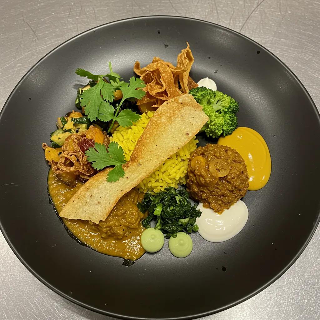
How Can You Plate Traditional Pakistani Dishes with Style?
Plating Pakistani dishes requires respecting communal traditions while applying modern styling principles to individual presentation, balancing authenticity with visual clarity. Traditional foods like biryani, karahi, and kebabs are often served family-style, where layering, garnishes, and communal vessels matter; when plated individually, preserve steam, texture, and signature garnishes—fried onions, coriander, and lemon—to retain cultural cues. This article appears as part of ARY News’ LifeStyle coverage and aligns with the site’s mission “To provide timely and comprehensive news and current affairs coverage, keeping the audience informed and engaged with diverse content.” Adapting plating templates for these dishes allows creators to honor communal origins while producing visually striking, photographable plates.
Below is a practical mapping of popular Pakistani dishes to plating approaches to help you apply styling choices without losing authenticity.
What Are Key Presentation Tips for Popular Pakistani Foods Like Biryani and Karahi?
For biryani, mold a compact serving to maintain grain separation and top with fried onions and coriander to provide color, aroma, and texture contrast, while preserving steam until shooting to capture vapor in photographs. Karahi benefits from shallow, rustic presentation in a wide bowl where oil sheen and chili slices read well; position lemon wedges and coriander to one side so they serve as a bright accent. For kebabs, consider vertical stacking or leaning against a small pile of seasoned rice or salad to show char marks and texture, and for chutneys and raitas use small ramekins or neat dot patterns to avoid pooling on the main item.
These small choices keep the dishes recognizable and culturally authentic while making them camera-ready, connecting traditional service with contemporary presentation techniques.
How Do Pakistani Chefs Incorporate Modern Styling in Traditional Cuisine?
Contemporary Pakistani chefs often simplify busy plates by isolating the main component and adding minimal, intentional garnishes that respect original flavors—using micro herbs instead of heavy chutney smears or placing fried onions as a calculated accent rather than a heap. Deconstruction techniques are used sparingly to present components separately while preserving the bite combinations diners expect. Minimalist plating for rich dishes reduces visual heaviness and allows texture and color to stand out, while modern garnish choices—like citrus gels or seeded crisps—maintain flavor integrity. These adaptations strike a balance between modern aesthetics and cultural authenticity that readers can emulate at home.
Adopting small modern moves—controlled smears, measured height, and precise garnishes—lets cooks translate celebratory dishes into individual plates without losing their traditional soul.
What Cultural Elements Influence Pakistani Food Presentation?
Cultural norms—such as communal eating, celebratory abundance, and color symbolism—influence how Pakistani food is prepared and presented; presentation choices often emphasize hospitality, generosity, and vibrant color palettes. Festivals and family gatherings favor large shared platters and layered presentations, while weekday home servings may be simpler and more utilitarian. Color symbolism also matters: saffron and red tones often convey festivity, while green herbs signal freshness and balance. Understanding these norms helps stylists choose when to preserve communal layouts versus when to adapt for individual plated service for photography or modern dining.
Respecting cultural context in styling ensures presentation choices feel authentic and considerate, while allowing room for creative adaptation in modern contexts.
What Tools and Props Are Essential for Professional Food Styling?
Professional food styling relies on a compact toolkit—tweezers, micro spoons, offset spatulas, squeeze bottles, and basic lighting modifiers—that provide precision and repeatability for plating and photography. These tools function as extensions of the stylist’s hands, enabling precise placement of micro-garnishes, controlled sauce application, and clean smears that read well on camera. Understanding the purpose of each prop helps you choose budget-friendly alternatives and scale up techniques without expensive gear. The table below compares common props and their best-use cases to guide purchase and practice decisions.
Intro to prop comparison: this table helps select tools by purpose and budget for precise styling.
Which Food Styling Props Enhance Visual Appeal?
High-impact props—plates, linens, cutlery, and boards—frame the food and influence perceived portion and mood; choose materials and colors that support the dish’s aesthetic without competing for attention. For curries and rich, colorful dishes, use neutral or dark plates to allow colors to pop; rustic boards work well for breads and skewers, and light linens can introduce subtle texture and warmth. Scale and color are critical: a tiny garnish on a huge plate will vanish, while oversized props can dominate delicate foods. Affordable thrifted ceramics and simple wooden boards provide varied textures and editorial options without large expense.
Selecting a coherent prop palette across a shoot creates a consistent visual language that strengthens brand or feed recognition and reduces decision fatigue during styling sessions.
What Are Advanced Styling Techniques Using Fake Ice and Water Droplets?
Advanced visual hacks such as glycerin-based water droplets and acrylic “fake ice” create the illusion of freshness and condensation without melting or diluting the food, but they must be used thoughtfully and safely. Glycerin mixed with water forms stable beads that adhere to surfaces for a fresh-from-the-kitchen look; acrylic or resin ice can mimic chilled displays without temperature problems. For edible shoots where food is consumed afterward, use food-safe alternatives like clarified sugar or chilled glass props, and always disclose any non-edible treatments if serving is intended. Application techniques include using brushes and droppers for controlled placement and testing under lighting to ensure the effect reads naturally.
Safety and transparency are paramount: clearly separate non-edible styling for staged images from edible plating intended for serving, and opt for edible methods whenever the food will be eaten.
How to Select the Right Equipment for Food Photography and Styling?
A minimal kit—smartphone with manual controls, a small tripod, a basic reflector, and a compact LED panel—covers most social and editorial needs and balances portability with quality. For more advanced work, an entry-level mirrorless camera with a 35mm or 50mm equivalent lens and a sturdy tripod enhances control over depth of field and low-light performance. Choose gear based on use-case: smartphone setups excel for social creators and quick shoots, while mirrorless/DSLR options serve longer editorial sessions. Recommended settings include manual exposure for consistent images, aperture control for desired depth, and RAW capture where possible for flexible editing.
Selecting equipment with an eye on portability and workflow efficiency helps creators produce consistent work without over-investing in gear they won’t regularly use.
What Are Quick Tips to Make Food Look More Appetizing Every Time?
Fast, repeatable habits deliver consistent presentation improvements: focus on freshness, contrast, timing, and simple composition templates that work across dishes. These quick tips are practical actions you can apply in the final minute before serving or shooting to elevate appeal with minimal fuss. Below is a concise checklist of one-line, actionable tips designed for immediate use in home and social contexts, followed by common mistakes and a short practice plan to accelerate your styling skills.
Quick, repeatable tips to improve appearance immediately:
- Wipe the plate rim: Clean edges make dishes read as intentional and tidy.
- Add one bright accent: A lemon wedge or herb leaf provides contrast and signal of flavor.
- Control shine: Use a light brush of oil on proteins to enhance sear without glare.
- Introduce texture: Sprinkle seeds or crisp shallots to add mouthfeel cues.
- Time the shot: Photograph while steam, crispness, and sheen are at peak.
Research consistently shows that visual presentation significantly impacts how we perceive and enjoy food, reinforcing the importance of these quick styling tips.
Plating for Perfection: Food Decoration Strategies for Aesthetic Appeal
The appearance of a dish is just as important as its taste. While it may seem unimportant, the art of decorating food in an enticing way requires skill and expertise. Over the past decade, research on food decoration and its impact on eating behaviour has significantly increased. Specifically, studies have examined how different sensory cues such as smell, taste, touch, sound, sight, and trigeminal sensations contribute to our perception of flavour when presented with various food and beverage options. Here this systemic review focuses on the latest evidence highlights the importance of contextual factors in food decoration and how they influence people’s behavioural and pleasurable responses to different food and drink items. Recent studies have emphasized the significance of factors such as color, shape, texture of food and plate ware, balance of elements on a plate, as well as environmental cues in determining what, how much, and how quickly individuals consume food and drinks, and even how much they enjoy the experience. Additionally, the role of tableware in eating, drinking, and flavour perception, and how a size-contrast illusion unknowingly leads consumers to serve and consume more food when using larger dinner plates and serving spoons, has been highlighted. These findings support the notion that people “eat first with their eyes” and that the visual presentation of a dish can greatly enhance or diminish a diner’s experience of the same ingredients. The aim of this study is to investigate how food decoration influences the intricate details of eating behavior and subjective motivation to eat. In conclusion, the visual presentation of food has a significant impact on various aspects of food perception, including satisfaction and
Plating for Perfection: An Exploration of Techniques for Optimal Food Decorating Strategies and Aesthetic Visual Appeal in Indian Cuisine, 2023
How to Use Height and Negative Space to Create Visual Interest?
Introduce height with stacking, leaning, or small mounds to add dimension and make plates read as three-dimensional rather than flat; complement height with negative space so the eye has a clear focal area. Use props like a compact bed of grains, a thin stack of vegetables, or a vertical vegetable spear to add lift without overpowering the plate. Negative space frames the focal item and prevents elements from merging visually, improving clarity in both service and photos. Simple angle choices—shooting slightly above or at a 45-degree angle—accentuate height and preserve negative space for better composition.
These layout templates are quick to apply and translate directly into more compelling images and better perceived portion balance at the table.
What Are Common Mistakes to Avoid in Food Styling?
The most frequent errors include overcrowding the plate, ignoring scale between props and food, overusing garnishes, and shooting after visual freshness has passed; each undermines clarity and appetite. Avoid these by planning a simple layout, checking scale by stepping back and viewing at serving distance, limiting garnish to purposeful accents, and always photographing before textures degrade. Over-editing images—unrealistic saturation or aggressive sharpening—can create a disconnect between expectation and taste, so edit subtly to preserve authenticity. Timeliness and restraint are the easiest corrective actions.
Recognizing and correcting these mistakes improves both presentation and trust with diners and viewers, leading to better engagement and repeatability.
How Can You Practice and Improve Your Food Styling Skills?
Develop a 30-day micro-practice plan: set a weekly focus (color, texture, lighting, composition), complete three styled plates per week, document progress with before-and-after photos, and solicit feedback through small peer groups or social A/B tests. Track simple metrics—likes, comments, and perceived freshness ratings from peers—to measure visual improvement and iterate on techniques. Use short timed challenges (15–20 minutes) to simulate real-service constraints and improve speed. Share images and reflections publicly to get constructive critique and build a portfolio of repeatable templates.
For readers who want to participate, consider sharing styled food photos with ARY News’ LifeStyle channels as a way to engage the community while aligning with the site’s mission “To provide timely and comprehensive news and current affairs coverage, keeping the audience informed and engaged with diverse content.” This collaborative practice both improves skill and connects styling work to broader cultural conversations.
Conclusion
Mastering food styling not only enhances the visual appeal of your dishes but also elevates the overall dining experience by engaging the senses. By applying principles of color, texture, and composition, you can create appetizing presentations that resonate with both viewers and diners alike. Embrace these techniques to transform everyday meals into stunning culinary showcases that reflect your creativity. Start experimenting with your plating today and share your creations with our community for inspiration and feedback!